Comviq
Kurppa Hosk helped Comviq better convey their brand promise and design better initiatives that engaged all users.
Business design
Brand implementation & management
Business design
Brand identity
Experience design
Packaging design
Digital product design
Challenge
As a discount brand, Comviq has chosen to eliminate everything that customers find less important. This idea, to always be the cheapest alternative and be in line with the times, Comviq calls “The modern price fighter”.
Comviq asked Kurppa Hosk to help convey the brand idea and define initiatives that would engage new and existing customers.


Approach
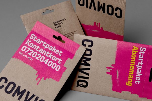
Comviq’s fast-moving, low-price nature was expressed through the use of running magenta-colored paint. The running paint, an analogy almost, as if the printing of the offers has not yet dried. In combination with a bold typography creates a strong and differentiating visual identity. This, at the same time becomes a flirt with the aesthetics of the service points (making their owners heroes). Kurppa Hosk also simplified Comviq’s brand architecture.

Outcome
The new visual identity was implemented in all digital and physical touch points, including service points, website, vouchers, SIM cards, startup kits, etc. Kurppa Hosk also developed a digital interface for “The world’s smallest cellphone store”, an in-store self-service kiosk where customers could buy Comviq subscriptions and phones on their own.


Related projects